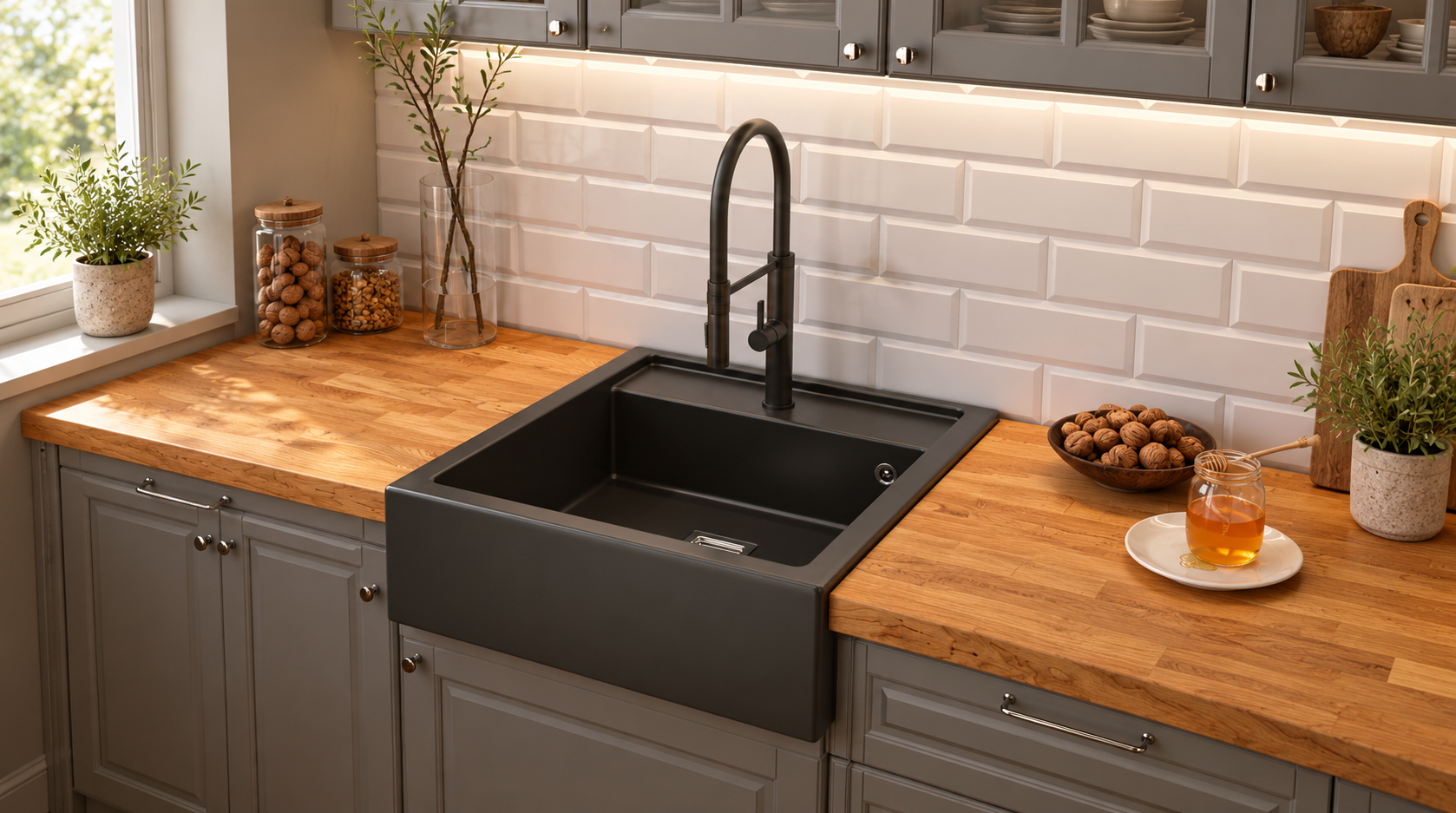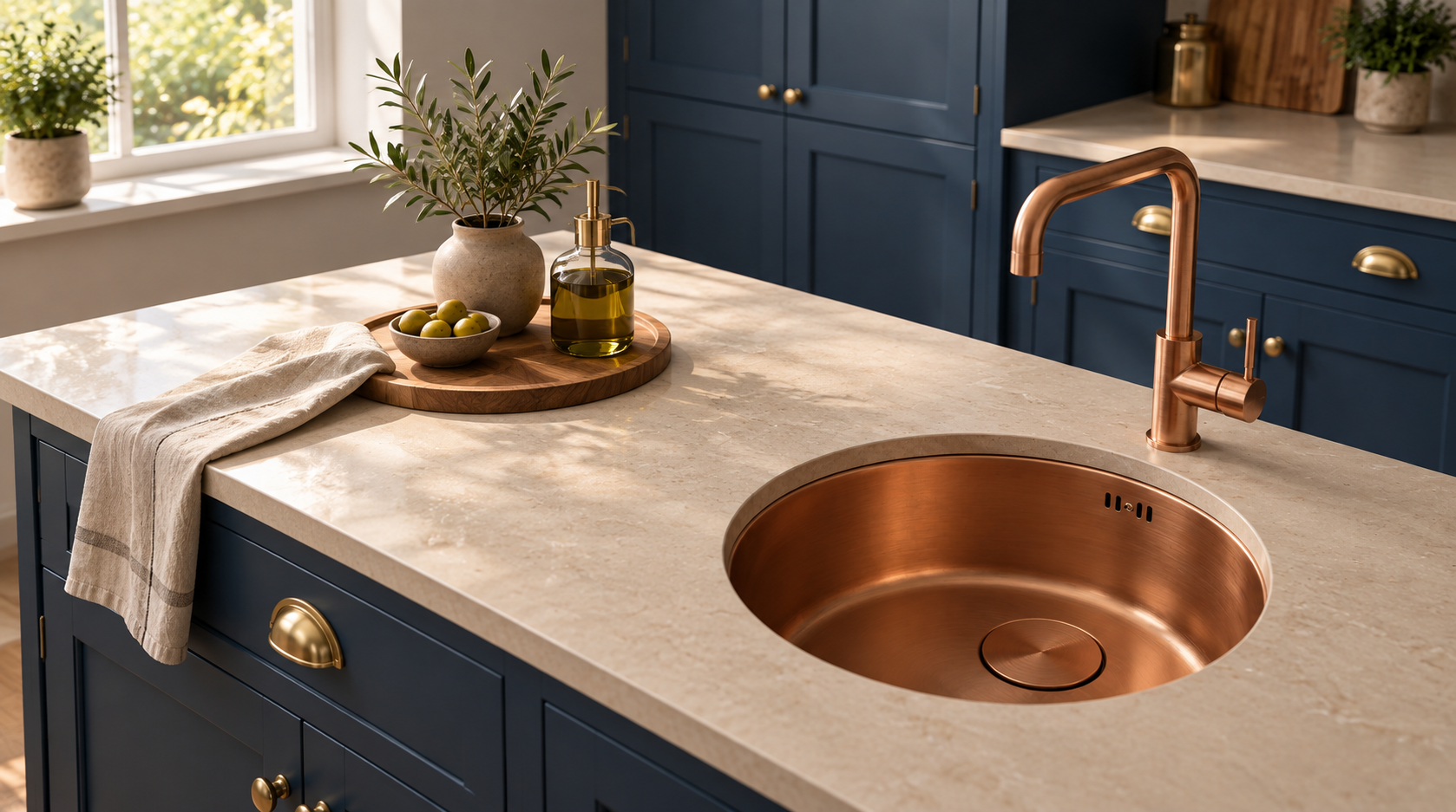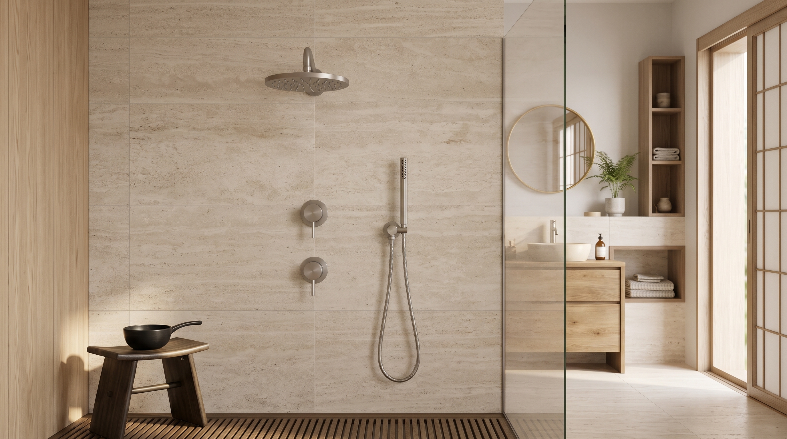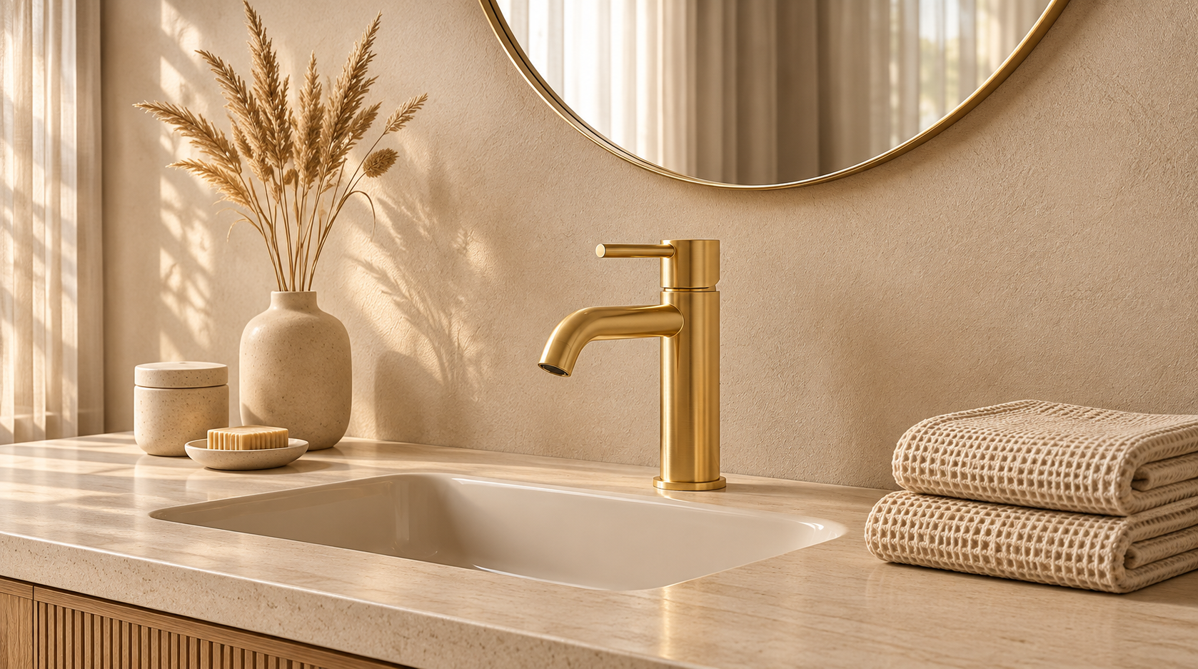
Aquanello Eterna brushed gold taps work best with seven colours: warm white, soft green, deep blue, light wood, sand, black and grey.
Aquanello Eterna is a range of bathroom taps and showers. The range comes in four colours: stainless steel, matt black, brushed copper and brushed gold. The shapes are rounded and simple, and the same in every colour. In brushed gold, you can choose from five basin taps, so you can pick the tap that suits your basin and keep the same colour in the shower and by the bath.
Why brushed gold works better than polished gold
Polished gold reflects a lot of light and can look overpowering. Brushed gold has a soft, even surface. It gives off a gentle glow rather than a sharp shine and shows fewer fingerprints and water spots. That makes it easier to combine with other colours, which is why the seven combinations below work so well.
How to choose your combination
Think about three things before looking at the seven colours. How much daylight does the bathroom get? How big is the space? And do you want the tap to be the first thing people notice, or a subtle detail? A bright, spacious bathroom can handle strong colours such as deep blue or black. A small or dark bathroom is better suited to soft, light colours, with the gold adding warmth without making the space feel smaller.
1. Warm white
Warm white is the safest and most popular partner for gold. Walls and tiles in cream, ivory or soft white make gold look gentle and bright. The bathroom feels light and clean, and the tap is a subtle detail rather than a bold statement.
Choose matt or lightly textured tiles where possible. Very glossy tiles create reflections that compete with the metal, causing the gold to lose its soft appearance. Light grout keeps the wall looking calm, while dark grout makes the space feel busier. Add a little texture so the space does not feel flat, for example with a woven basket, a cotton towel or a wooden stool. Cool, bright white tiles can make the gold look yellower than you want, so look at the tile and tap together before deciding.
2. Soft green
Sage green and olive green are natural partners for gold. Both are earthy, so the combination feels calm and a little classic. It also brings plants to mind, which is a pleasant feeling in a bathroom.
You do not need to cover the entire space. Use green on one wall, on small tiles behind the basin or on a cabinet, and keep the floor and ceiling light. A green tile with a matt or slightly irregular texture looks particularly good because it adds depth alongside the soft gold. This combination works well with light wood and white towels. Very bright or neon-like greens make gold look cheap, so choose a green with a little grey in it.
3. Deep blue
Navy blue and dark blue make gold stand out. The contrast is strong and clear, and the space feels rich and confident. This is the combination for a bathroom with a distinct character.
Light plays a major role here. In a bathroom with a large window or good lighting, a deep blue wall looks beautiful. In a small, dark space, use blue on one wall or on the lower half of a wall, and keep the ceiling and floor light so the space does not feel cramped. White bathroom fixtures, white towels and a light floor keep everything looking fresh. Try not to combine deep blue with black in the same space, as the two dark colours will compete with each other.
4. Light wood
Light oak, ash and birch share gold's warm tone, so they go together effortlessly. The result is soft and natural, with a Scandinavian feel. A wooden shelf, a vanity unit or a small stool by the basin is enough.
Check the undertone. Pale, neutral wood creates a calmer look than red or orange wood, which can make the gold look yellow and the whole space feel too warm. If you are unsure, place a wood sample next to a sample of the tap colour and look at them during the day and in the evening. Wood in a bathroom must be treated to withstand moisture, so ask the supplier which wood is suitable. Keep the walls light and let the wood and gold be the two warm details.
5. Sand and limestone
Sand, beige and natural limestone give gold a calm backdrop. All the colours are warm, so the bathroom feels like one soft, cohesive space. The gold is visible but not loud. This combination works well in a calm, spa-like bathroom.
Because everything is similar in tone, texture becomes important. Look for a stone tile with a soft, natural surface, a textured linen towel or a ceramic dish with a handmade look. These small details bring the space to life. If the walls, floor and furniture are all the same warm beige, the space can feel flat. So add a lighter and a darker shade, such as white towels and a dark wooden mirror frame, to give the gold something to stand against.
6. Black
Black and gold are a striking pair, but use black as an accent. A black mirror frame, a towel hook, a light fixture or a thin line around a window looks crisp next to brushed gold. Together, the two colours give the space a clean, graphic look.
The most common mistake is using too much black. If black covers half the space, the look becomes heavy and formal. A good rule of thumb is: mostly light colours, a little black and a little gold. Walls and floors in warm white or light grey keep the balance. Choose matt black, not glossy black, to suit the soft appearance of the brushed gold. Dark colours absorb light, so in a small bathroom, use black in no more than two small places.
7. Light grey and marble
Cool grey and white marble balance the warm tone of gold. The grey keeps the space fresh and calm, while the gold adds the warmth that grey often lacks. It is a good choice if you find an entirely warm colour scheme too soft.
Choose a light grey, not a dark grey, and marble with subtle veining. Strong, busy patterns compete with the tap, leaving the eye unsure where to look. An even, honed surface works better than a very glossy one. If the grey is very cool and bluish, the gold may look too yellow beside it. A grey with a slight warm undertone, also known as greige, is the easier choice. Add white towels and a few natural materials, such as a wooden tray or a plant, to complete the look.
Choosing the right gold basin tap
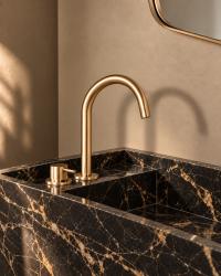
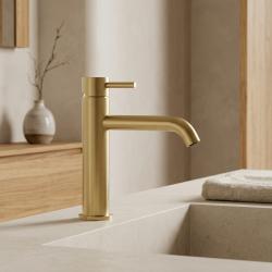
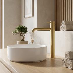
Choose the tap based on the basin, not just its appearance. A single-lever basin tap is the simplest choice and suits most bathrooms. If your basin sits on the countertop, a tall tap gives the water enough clearance. A 2-hole basin tap is made for a basin or countertop with two holes. A wall-mounted 2-hole tap gives the cleanest look, as only the spout and control remain visible. A wall-mounted spout keeps the countertop clear. Check the height and spout dimensions on the product page and compare them with your basin before ordering.
Light changes gold
Gold looks different in every kind of light. Warm, soft light makes it glow and look rich. Cool white light makes it look flatter and slightly greenish. Choose warm lighting by the basin and mirror, and look at the tap both during the day and in the evening before choosing the wall colour.
Gold that stays understated
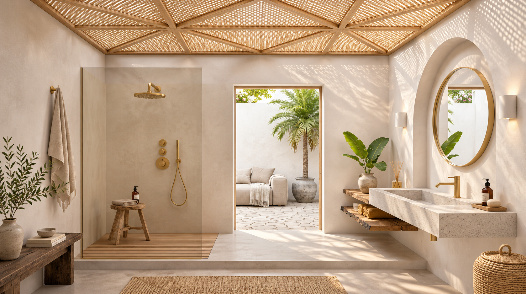
Brushed gold is easy to love and easy to overuse. Choose one gold finish, combine it with one of the seven colours above and keep the rest simple. Then the bathroom will look warm, calm and thoughtfully designed.
Frequently asked questions
Which colours go with brushed gold taps?
Warm white, soft green, deep blue, light wood, sand, black and light grey all go well. Warm white is the safest choice.
Is Aquanello Eterna available in brushed gold?
Yes. Aquanello Eterna is available in brushed gold, with five basin taps in the same simple, rounded shape as the other colours.
Which Aquanello Eterna gold tap suits a countertop basin?
The tall single-lever tap. It is designed for basins that sit on the countertop.
Does gold go with black?
Yes. Use black as a small accent, such as a frame or a hook, and keep the walls light.
Can I combine gold and copper in the bathroom?
Yes. Both have warm tones, so they work well together. Choose one as the main metal and use the other as a small accent, with the same brushed finish. Chrome is harder to combine because its cool, shiny appearance clashes with soft gold.
What is the difference between gold and copper taps?
Gold is more yellow and feels bright. Copper is pinkish-orange and feels earthy.
How much gold is enough in a bathroom?
Two or three touches are a good start: for example, the basin tap, the shower and the basin waste. Any more than that, and the gold can start to feel overwhelming.
Is brushed gold difficult to keep clean?
No. A brushed surface hides small marks. Wipe it with a soft cloth, mild soap and warm water, avoid scouring pads and harsh cleaning products, and dry the tap after use.